Carbon Trust: Degree Days Tool
Here’s a guest article from a friend of mine: enjoy!
“…all other things being equal, colder outside means more gas burnt inside to keep us warm. But how to disaggregate weather effects from energy efficiency measures and lifestyle changes? The key is the ‘degree day’ concept”…
I thought I’d let you and your readers know about my investigations into measuring the energy efficiency of my light-green old house, a late Victorian semi. It was prompted when EdF started sending me gas and electric bills comparing the most recent quarter with that of a year ago (see http://www.edfenergy.com/edf-energy/showPage.do?name=homeenergy.payingBill.understanding.gas.bill.til). It’s easy to be sceptical about how valuable such information is, so that’s what I was, but wanted to find out what suppliers could tell consumers that would be of use.
I suppose at some level it is raising awareness that our consumption changes over time, and that what we do has an effect. But it’s a weak message, and of course not very meaningful just to present the raw data. Take a look at my gas use in April over the last four years, during which time I have been putting in place various ‘energy 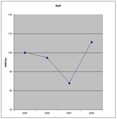 efficiency’ measures: (!)
We moved into the house in late 2005. Got the full monty of loft insulation in summer 2006, new gas condensing boiler in winter 2006, and I’ve had a running programme of sash window renewal/draught exclusion. So what happened this year? Ok, there have been lifestyle changes – Elliot was born in February 2007 and the house is occupied more with my wife at home an extra 2.5 days a week.
The other major factor is, of course, the weather: all other things being equal, colder outside means more gas burnt inside to keep us warm. But how to disaggregate weather effects from energy efficiency measures and lifestyle changes?
The key is the ‘degree day’ concept: one ‘degree day’ is a day at which the outside temperature is one degree less than a reference temperature. The reference temperature is that at which the building would not require heating beyond internal sources, like from lights, cooking, people and all our gadgets on standby; by convention it is taken as 15.5C. For example, a day when the average external temperature is 10C gives a score of 5.5, and over the course of a week or month all the daily scores are added to give a figure we can use for some analysis. Higher number = colder and more heating needed.
It’s really a bit more complex than this, and my calculations below are just the first step in applying degree days to understanding energy usage patterns. The Carbon Trust has an excellent publication, and provides monthly degree days data for UK regions. The Environmental Change Institute at Oxford University has weekly data at no cost and covering more locations (there are providers that charge for data, I expect they also take the daily temperatures freely from the Met Office web site, and ‘add value’). [ps follow the Oxford link to see new Google group on building energy management, with dedicated thread on degree days.]
First step – have a look at the correlation between gas use and number of degree days in April from the last four years:

Brilliant! And it’s only taken minimal tinkering with the axes to make it look that good. This April was colder than last, I remember that, but the number of degree days gives a quantity we can use to measure the effect on energy use.
The real analysis comes when you plot degree days against energy use for all months:
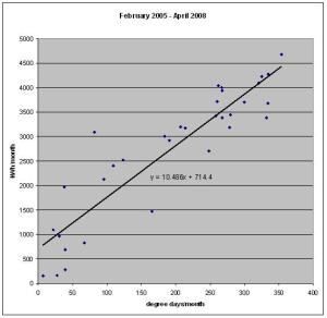
Ok, there’s quite a lot of scatter (and there are reasons for it I won’t go into here), but to my (physicist’s) eye it’s linear, so I’ve added a least squares regression fit – the so-called ‘performance line’. Non-zero intercept is from non-weather related energy (gas) consumption, and given the Aga is blasting away (sorry! that’s 70kWh/day most of the year, but also providing the hot water), I don’t think that’s so bad. Encouragingly (I think), the slope for months in 2005 and 2006 is steeper (10.8 ) than 2007 and 2008 (9.8), so I’m now using 10% less energy for a given requirement to heat the house.
In a way it’s a shame I didn’t get a year or two of base-line data before any improvements, but there you go. Going forward, as civil servants like to say, there are plenty of ways to track how well the house is performing which the CT publication details. But, back to my original gripe… can energy suppliers give consumers better information on their use?
Short answer, with current ‘dumb’ meters: no. Precise weekly or monthly readings are needed to match the weather data and get sufficient data points to plot a meaningful line. More constructive answer: I suspect that ‘typical’ slopes and intercepts of the performance line could be worked out for an ‘average’ terrace/semi/detached of a given age, energy use normalised for the weather, meter readings interpolated, and the home ‘rated’ on each bill. But that’s a research project for someone else.
As it is, I’m on a monthly direct debit to get a cash discount, EdF changes the amount quite regularly (up and down) with little evident reason, and probably more in response to energy price changes than anything I’ve done to improve efficiency, or the weather. I can see little incentive for consumers in general to change behaviour on the basis of this new information suppliers are giving. Now give us smart meters and personal carbon allowances and see what that would do…
Cheers
Jonathan

Leave a comment